He remains faithful to a small handful of typefaces including Bell, Bodoni, Eric Gill's Sans, Joanna and Modern, believing that the choice of typeface need not be arbitary as quoted in his book 'Notes of Book Design'.
'The suitability of a typeface to the subject of the book is less important than to the nature of its text. Text that contains dates, dimensions, formulae or footnotes needs a face with good numerals, fractions and mathematical sorts. Here, a type with numerals smaller than the capitals, such as Bell and Joanna, works well.'
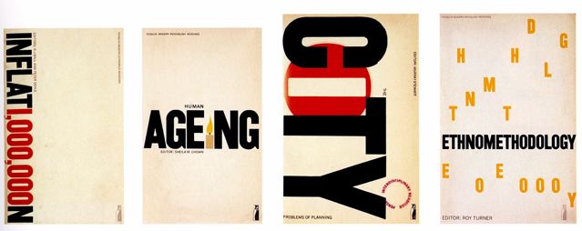
This can clearly be seen in examples of book cover designs shown below. Birdsall keeps his designs very simple yet interesting, playing with type whilst maintaining legibility and keeping in mind his context.
Matthew Carter born just a few years later in 1937, was at the forefront of the transition from physical metal type to digital type. Unlike Birdsall, Carter did not show particular reverence to "old-fashioned" typefaces and designed many of the typefaces we use commonly today. These include typefaces such as verdana, designed to be readable at small sizes on a computer screen as well as Tahoma, Georgia, variants of Helvetica and many others..
Co-founder of Bitstream Inc and Carter & Cone, Carter worked for many prominent newspapers as well as for Apple and Microsoft to create typefaces for everyday mass use.
Yet Carter and Birdsall did have one thing in common, which was the dedication to simple, sophisticated and above all legible typefaces, with a focus on context.

For example Bell Centennial, a typeface commissioned by AT&T in order to fit substantially more characters per line without loss of legibility especially in small point sizes, for use in a telephone directory. Carter overcame issues with ink spread from high speed printing by opening up counters and bowls as well as placing ink traps (Shown on the side) which were not visible in small point sizes in print as intended.
Similar contextual awareness is seen in Birdsall's recent work in redesigning the Church of England's Common Worship Prayer book. With a simple poetic italicized Gill Sans on the cover and practical, legible layout of text on the inside.


So although Carter and Birdsall lived through the same time period, both designers worked in and with two opposite sides of typography. With Birdsall choosing to stick with the more traditional, older typefaces whilst Carter chose to jump straight into the up and coming digital typography world.
Yet both men clearly had similar philosophies and ideas towards typography and therefore ideologically contributed to typography in similar ways, whilst working with predominantly either a pre-digital or digital manner.
Sources:
Mike Dempsey, "Derek Birdsall: Between the covers", viewed 22nd September, http://mikedempsey.typepad.com/graphic_journey_blog/2009/06/between-the-covers.html
Design Museum & British Council, "Derek Birdsall" Biography, viewed 22nd September, http://designmuseum.org/design/derek-birdsall
Nick Sherman, "Bell Centennial Form & Function: A detailed looka t the telephone book typeface", viewed 22nd September, http://nicksherman.com/articles/bellCentennial.html
Design Museum & British Council, "Matthew Carter" Biography, viewed 22nd September, http://designmuseum.org/design/matthew-carter
No comments:
Post a Comment