Friday, July 29, 2011

GILL SANS


Gill sans is a sans-serif typeface designed by Eric Gill. Gill Sans was first seen as a shopfront sign in 1926, but only released as a single uppercase weight in 1928. This type was created by Eric Gill had been studying under the calligrapher and stonemason Edward Johnston who had recently designed the typeface for the London Underground. Gill had taken great influence from the style that Johnston had produced, and aimed to create the ultimate legible sans-serif font. Gill had initially just done sketches of the font until Stanley Morison wanted to turn it into a fully realized typeface to combat the likes of other typefaces being released in Germany at that time such as Futura, Kabel and Erbar.


Gill sans came to major popularity when it was commissioned to be used on the London and Northeast Railways, on all their posters and in all publicity material. Most people would be familiar with Gill Sans these days as it appears in many publications and is distributed as a standard font in most operating systems such as Microsoft and Apple.


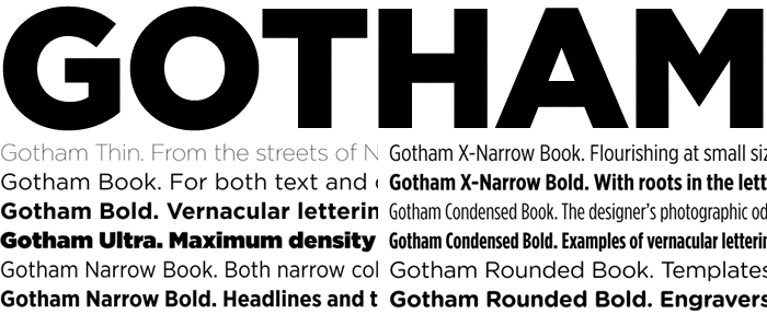
The Gill Sans typeface family contains fourteen styles, and has less of a mechanical feel than geometric sans-serifs such as Futura, this is because its basic proportions are based on classic Roman letterforms, and not geometric shapes. Gill Sans also has a more pronounced contrast in stroke widths than most serifless fonts, making the design more appealing to the eye, and ultimately more readable than other single stroke fonts.


One reason for the enduring success of Gill Sans is the fact that each weight retains a distinct character of its own. The light font, with its heavily kerned ‘f’ and tall ‘t’, has an open, elegant look. The regular font has a more compact and muscular appearance, with its flat-bottomed ‘d’, flat-topped ‘p’ and ‘q’, and short, triangular-topped ‘t.’ The bold font tends to echo the softer, more open style of the light, while the extra bold and ultra bold have their own unique personalities. Gill Sans can seem friendly in its lighter weights, making it perfect for body text with its limited adornments and its rounded letterforms, making It good for magazine and book work. In Bold it makes for good signage displays, advertising, packaging and labels.


I feel that the font is clean and easy to read. The characters are hard, sculptured forms whichshow Gill’s artistic roots and an understanding of the way in which type should be read. It embraces traditional forms and proportions, which give the face a humanist feel.


From reading through blogs and publications, it appears that there are some negative opinions on the font, generally that it is overused. Other sources say that the basic glyph shapes do no look consistent across font weights and widths, especially in bold varieties. However, even in lighter forms of the font such as book and medium, the letters to not look consistent. The letter ‘a’ seems to be commonly negatively judged, critics say it is top heavy, unbalanced and overall weird looking.


Rounding out the practical benefits of Gill Sans: The face is space-economical. More information can be set in a given space when using Gill Sans than with most other sans serif designs.


Millington, Roy (2002). Stephenson Blake: The Last of the Old English Typefounders. Oak Knoll Press.


Boulton, Mark (2008). Typeface of the month, Gill Sans. www.markboulton.co.uk/journal


Thursday, July 28, 2011

GOTHAM


GOTHAM GOTHAM GOTHAM (the typeface. not the city from batman.)

Gotham belongs to the sans-serif family. Quite a modern font
in terms of its age, it was born in the year 2000. The font of the future was designed by an American type designer called Tobias Frere-Jones. Throughout mid-twentieth century New York City, lay an array of architectural signage. This particular signage became quite popular and formed part of Frere-Jones' inspiration to creating this very font.

To start off, Gotham was introduced with a range of varying widths as well as an italic design. Print magazine commissioned the introduction of a rounded variant to the italic Gotham. Hoefler and Frere-Jones introduced new Narrow and Extra Narrow versions in 2009. With the recent presidential campaign, Obama had his people, who must know some other people, to get Hoefler and Frere-Jones to create a customised version of Gotham with serifs.
"Can We Add Serifs to Gotham? For the President of The United States? Yes We Can."


Gotham seems somewhat familiar even though it is so new. It has been used in many many cases from the Presidential Campaign for Obama to Coca Cola, Yahoo! and discovering things on the Discovery Channel. Gotham inherited an honest tone that's assertive but never imposing, friendly but never folksy, confident but never aloof. The font includes a lowercase, italics and comprehensive range of weights.

The original Gotham font was space-efficient, however they went along with designers requests to re-image Gotham as a text face. Thus, Gotham Narrow was born and specially engineered for text sizes. Gotham Narrow has the perfect proportions to fit any cramped situation whilst still retaining the original Gotham personality.

Gotham Condensed is has built on the original font by creating nine different weights ranging from Ultra to thin. The font itself is quite simple. It manages to be bold and sharp without weighing to much. It is simple, yet sophisticated.


Wednesday, July 27, 2011

ROCKWELL


In 1910 the Inland Type Foundry created the Rockwell typeface. The Inland Type Foundry merged with other companies and formed the American Type Foundries (ATF), and refined the Rockwell typeface in the 1920’s under the direction of Morris Fuller Benton. Benton is known to be one of the great type designers in history, and being chief type designer at ATF, completed 221 typefaces including those such as Franklin Gothic, Broadway, ATF Bodini and numerous others.

In 1934 a company specializing in typesetting and typeface design, The Monotype Corporation, issued a new version of Rockwell. This was during a period when slab serifs were experiencing a revival. The revision of this typeface was under the supervision of Frank Hinman Pierpont, and where slipups took place and Rockwell was instead referred to as Stymie Bold. This has therefore resulted in some speculation over its proper title, still today.

Rockwell lives under the Egyptian, or slab serif, classification, using very heavy, unbracketed serifs that are uniform in thickness with the main strokes of the letters. This makes the typeface design monoline, where thick, block-like geometric serifs are applied to the letterforms. The typeface uses the four weights of light, medium, bold and extra bold, all with matching italic fonts. Condensed and bold condensed variations are also available, however without italics. Rather than leaning towards an oval shape, the particular letters that have closed rounded counters appear to have a more circular form, such as in the g, p, q and even c(which is has an open counter). Half serifs are applied to open countered letters such as m, n, and h.

Rockwell is proportionally spaced, making it nicer and easier to read. This therefore makes the design well suited to professional publishing or printing material that is most appropriately applied in use for advertisements, headlines, posters, logos and short text blocks, rather than in extensive bodies of text. When used in this appropriate text composition, the overall appearance of Rockwell strongly generates a sense of straightforwardness and somewhat integrity.

The multiple font and scale variations of Rockwell in this American Boy Scout graphic poster have been used to their full potential. The characteristics of Rockwell that are strength and boldness perfectly mirror the visual communication given in the image of these three boys. It rightly demonstrates the notion of Rockwell being ideal for short text blocks and headlines.

The uniform, clean and mechanical aesthetic marries in effectively and appropriately with such subject matter as used in this photo for a cover of a technical brochure.

In contrast, the mechanical layout and simplicity of the typeface does not look misplaced or take away from the variety of fabrics shown in this photograph for menswear samples.

The able applications of Rockwell in these contrasting layouts illustrate its power as a graphic communicator, helping the Rockwell typeface sustain its use in publishing material for decades.

Reference List:
1. C. Perfect, The Complete Typographer: "A Manual For Designing With Type". Little Brown and Company Ltd, Great Britain, 1992
2. M. Solomon, The Art of Typography: "An Introduction to Typo.icon.ography". Watson-Guptill Publications, New York, 1986.
3. M. Klein, Type and Typographers. Architecture Design and Technology Press, Great Britain, 1991.
7.
8.

Tuesday, July 26, 2011

Avant Garde

Created by Herb Lubalin in 1968, this font family was based on the font used for the logo of Avant Garde Magazine. The condensed fonts were drawn by Ed Benguiat in 1974, and the obliques were designed by André Gürtler, Erich Gschwind and Christian Mengelt in 1977
The font family consists of 5 weights (4 for condensed), with complementary obliques for widest width fonts.

In 1964, Lubalin started his own design consultation firm named Herb Lubalin, Inc. (mighty original). During these years, he collaborated with Ralph Ginzburg on Eros, Fact and Avant Garde where he served as creative director and designer for these publications.

Lubalin’s letterforms with tight-fitting combinations reflected Ginzburg’s desire to capture the advanced, the innovative and the creative in a font. The character fit was so perfectly tight that they created a futuristic, instantly recognisable identity for the publication.

Later he and Tom Carnase, a partner in Lubalin’s design firm, worked together to transform the idea into a full-fledged typeface.

“I asked him to picture a very modern, clean European airport (or the TWA terminal), with signs in stark black and white,” Ginzburg’s wife and collaborator, Shoshana recalled, “Then I told him to imagine a jet taking off the runway into the future. I used my hand to describe an upward diagonal of the plane climbing skyward.”

Tony DiSpigna, one of Lubalin’s partners and co-creator of ITC Lubalin Graph and ITC Serif Gothic, has been quoted as saying, “The first time Avant Garde was used was one of the few times it was used correctly. It’s become the most abused typeface in the world.” Ed Benguiat, one of type’s legends and a friend of Lubalin’s, commented,

“The only place Avant Garde looks good is in the words Avant Garde. Everybody ruins it. They lean the letters the wrong way.”

Steven Heller also noted that the “excessive number of ligatures were misused by designers who had no understanding of how to employ these typographic forms,”
further commenting that
“Avant Garde was Lubalin’s signature, and in his hands it had character; in others’ it was a flawed Futura-esque face.”

I disagree with this statement, while the initial intent of the font has changed. I’d argue that it’s evolved. While it doesn’t have the symmetry of it’s original design. I rather like the sporadic yet uniform nature of the typeface, making it more novel and exciting in my opinion.

Because of its decorative nature, Avant Garde hasn’t been widely used in advertising. It has a retro feel while still having a modern look. It’s extremely tight fitting with very little gap between lettering and it’s slopping nature makes it even more compact. Its chic, a little bit euortrash and very eyecatching.


References

http://www.rightreading.com/typehead/avant_garde.htm
http://en.wikipedia.org/wiki/ITC_Avant_Garde
http://www.itcfonts.com/Fonts/Classics/AvantGardeGothicPro.htm
http://www.thinkingforaliving.org/archives/147

-Ray Ali

ROCKWELL


In 1910 the Inland Type Foundry created the Rockwell typeface. The Inland Type Foundry merged with other companies and formed the American Type Foundries (ATF), and refined the Rockwell typeface in the 1920’s under the direction of Morris Fuller Benton. Benton is known to be one of the great type designers in history, and being chief type designer at ATF, completed 221 typefaces including those such as Franklin Gothic, Broadway, ATF Bodini and numerous others.

In 1934 a company specializing in typesetting and typeface design, The Monotype Corporation, issued a new version of Rockwell. This was during a period when slab serifs were experiencing a revival. The revision of this typeface was under the supervision of Frank Hinman Pierpont, and where slipups took place and Rockwell was instead referred to as Stymie Bold. This has therefore resulted in some speculation over its proper title, still today.

Rockwell lives under the Egyptian, or slab serif, classification, using very heavy, unbracketed serifs that are uniform in thickness with the main strokes of the letters. This makes the typeface design monoline, where thick, block-like geometric serifs are applied to the letterforms. The typeface uses the four weights of light, medium, bold and extra bold, all with matching italic fonts. Condensed and bold condensed variations are also available, however without italics. Rather than leaning towards an oval shape, the particular letters that have closed rounded counters appear to have a more circular form, such as in the g, p, q and even c (which is has an open counter). Half serifs are applied to open countered letters such as m, n, and h.

Rockwell is proportionally spaced, making it nicer and easier to read. This therefore makes the design well suited to professional publishing or printing material that is most appropriately applied in use for advertisements, headlines, posters, logos and short text blocks, rather than in extensive bodies of text. When used in this appropriate text composition, the overall appearance of Rockwell strongly generates a sense of straightforwardness and somewhat integrity.

The multiple font and scale variations of Rockwell in this American Boy Scout graphic poster have been used to their full potential. The characteristics of Rockwell that are strength and boldness perfectly mirror the visual communication given in the image of these three boys. It rightly demonstrates the notion of Rockwell being ideal for short text blocks and headlines.

The uniform, clean and mechanical aesthetic marries in effectively and appropriately with such subject matter as used in this photo for a cover of a technical brochure.

In contrast, the mechanical layout and simplicity of the typeface does not look misplaced or take away from the variety of fabrics shown in this photograph for menswear samples.

The able applications of Rockwell in these contrasting layouts illustrate its power as a graphic communicator, helping the Rockwell typeface sustain its use in publishing material for decades.

Reference List:
1. C. Perfect, The Complete Typographer: "A Manual For Designing With Type". Little Brown and Company Ltd, Great Britain, 1992
2. M. Solomon, The Art of Typography: "An Introduction to Typo.icon.ography". Watson-Guptill Publications, New York, 1986.
3. M. Klein, Type and Typographers. Architecture Design and Technology Press, Great Britain, 1991.
7.
8.

Akzidenz Grotesk


"It is the work of anonymous typecutters: craftsmen, specialists, whose professional background and experience meant they were familiar with the finest subtleties and principles, and not just those of Grotesque. They gave Akzidenz-Grotesk the ultimate accolade a typeface can have: a functional, formal rightness, transcending the whims of fashion."
-- Karl Gerstner


Akzidenz-Grotesk has been one of the world’s most influential typefaces and one with one of the greatest legacies. Widely accepted and the first Sans Serif to be broadly distributed, Akzidenz was released in 1896 by Berlin based Type foundry, H.G. Berthold. It was used directly by Max Miedinger when designing the typeface Neue Haas Grotesk in 1957, while attempting to render the typeface more ‘even & unified.’ Neue Haas Grotesk was three years later, renamed Helvetica and instantly shot to superstardom receiving both extensive popularity and universal acclaim. Other typefaces released around the same time, Univers and Bauer by Adrian Fruitiger and Folio by Baum are also heavily inspired by Akzidenz-Grotesk


Akzidenz-Grotesk as its name would suggest is a Grotesque (early sans-serif.) typeface. As with most sans serifs, Akzidenz is more typically used for short and simple phrases such as headlines. This is due the fact that serifs help direct the eye along larger bodies of texts and sans serifs are more usually blacker. It is more tolerable to use san-serif type for considerable blocks of text in Europe. (Oh, Europe.)


Because of their similarities, it is unavoidable when critiquing Akzidenz to not mention its much more famous, younger brother, Helvetica. Akzidenz is overall, more condensed. Even though the more circular letters like C, G, O, and Q are wider and more geometric than in Helvetica. Both do have in common the unusual perpendicular bar on the uppercase G. The decenders on Akzidenz’s j does not return quite so vertically as Helvitica’s and Akzidenz has a smaller x-height. Both typefaces come in an extensive variety of weights, condensed and expanded forms. Considering their similarities you might say, “There’s no need to use another typeface so alike to Helvetica. Helvetica is fantastic. It’s The Beatles of typefaces.”


And you’d be right. It is The Beatles of typefaces…


…but The Beatles, let Ringo sing a song on every album.


And in Max Miedinger’s masterpiece Helvetica, Ring Starr sings lead vocals on track 18: “Uppercase R.”


While some find the oppressive, vulgar tail on Helvetica's upper case R charming, it is undoubtedly the soft exposed flesh underneath Helvetica’s 25 character steel breastplate. Although there is little honour is exposing the weaknesses of others only to make oneself seem superior by comparison; Akzidenz’s relationship with it’s immediately family is bitter, petty and ultimately leads to half-drunken snide remarks during Christmas Dinner.


Akzidenz-Grotesque is an archetype of typographic design. Its almost faultless construction has remained constantly relevant over a century later. And although it might too often be upstaged, Akzidenz will always, have a leading role in my heart.


-B Marriott


References:
<
http://www.behance.net/gallery/A-Grotesk-Love-Affair/1339317>

< http://www.linotype.com/en/795/thesansseriftypefaces.html?PHPSESSID=fe21705bd465507fdbeb66a41015eb7d>

< http://www.rightreading.com/typehead/akzidenz_grotesque.htm>

< http://www.bastoky.com/HistoricClasses.htm>

< http://www.eyemagazine.com/feature.php?id=143&fid=613>

< http://www.microsoft.com/typography/links/news.aspx?NID=5711>

FUTURA


German designer Paul Renner designed the sans-serif typeface Futura in 1928. It was originally manufactured by the Bauer Type Foundry in Frankfurt, and is considered to be one of the most famous of the geometric san-serif types. Even after 80 years since its first publication, the Futura family is still being used in contemporary design. Its perpetual application may be due the monotone flow and very geometric style.


This geometric form can be especially noticed in the ‘O’, ‘Q’, and ‘C’ letters, as they resemble almost perfect circles. In keeping with this flow of simplicity and balance, other shapes such as the triangle and square are dominant in many of the angular letters. The sharp apexes and recognisable shapes makes Futura a great display type, as the eye is easily able to distinguish between the letters. With long ascenders and descenders in the lowercase letters, the ‘i’ and ‘j’ can sometimes be mistaken, which makes it difficult to read small set Futura for long periods of time. However, the slight tapered curves give the lines a smooth connection point. This optically allows for the letters to appear ‘lighter’ on the page, creating a more pleasant read.


Futura can be described as a typeface of its time, as the almost perfect geometric shapes were clean, sharp and radically different. Word had spread in Europe, and soon after many American type foundries had began creating Futura look-alikes in order to keep up with Renner’s success. Typefaces such as ‘Metro’ by William Dwiggins, and ‘Spartan’ by American Typefounders were just some of the competitors tying to contend during the 1930’s. At the same time, other designers were inspired by Renner’s geometric philosophy and began creating slab serif typefaces. These included ‘Beton’ in 1931, and ‘Rockwell’ in 1934.


The harmonious marriage of curved and straight lines used in Futura create a contrasting alphabet that allows each letter to be distinguished from the next when read. This pure type has had great use in children’s novels and in primary education. When used as a display font, the sharper letters such as ‘M’, ‘N’ and ‘W’ have extra long apexes. These extrusions stand above and below the cap height, which visually presents the type as modern and cutting edge. It is subtle features like these that make Futura an everlasting choice for designers.


Over the years the Futura family has grown with many additions such as the bold and oblique fonts in 1930, extra bold and extra bold oblique in 1936, and finally the light and light oblique versions released in 1950. Its large family and neutral tone have allowed for many applications including the historic moon landing in 1969, where Futura was used on the commemorative plaque. The typeface has also been used in many movies such as ‘V for Vendetta’, and has been adopted by companies such as Volkswagen and Sesame Street.


There are many popular typefaces that resemble the geometric ideals that Renner created back in 1928. Fonts such as Helvetica and Verdana carry similar qualities that bring a slightly more modern feel to the page. However, in saying this, Futura is still an exciting typeface that matches up to many of these more modern san-serifs that we see today.


References:

1: C Perfect, The Complete Typographer ‘A manual for designing with type’. Little, Brown and Company, Great Britain, 1992.

2: M Klein, Type and Typographers. Architecture Design and Technology Press, Great Britain, 1991.

3: M Solomon, The Art of Typography. Watson-Guptill Publications, New York, 1986.

4: http://en.wikipedia.org/wiki/Futura_(typeface)

5: http://weareall.analogue.ca/category/typography/page/3/

Gotham


Gotham is a big, blocky and un-embellished typeface, and according to critics one of the more important typefaces of the 21st century. It is my favourite because of its ability to function as a light body typeface, as well as a dominant, face-smashing headline (with Gotham 'Ultra').


History

Gotham was designed in 2000 by native New-Yorker Tobias Frere-Jones as a commission for GQ men's magazine. They still use it - not on the cover nameplate, just on the titles. He took inspiration from the decrepit signage of 1930s Manhattan. More specifically, this building...


It rose to prominence in 2008 by being the 'Obama font'. In fact, it was part of a concerted visual identity that is credited with giving a great deal of credibility to Obama's well funded campaign. There is a good interview here with Michael Bierut (the guy from the Helvetica movie) about his brand.


Critique

Gotham is a stripped-back, 'architectural' typeface, much in the way of Bauhaus-inspired geometric typefaces, like Futura (and before that Akzidenz-Grotesque). The designer himself stated "it's the letter ... an engineer would make". Others have likened it to the Manhattan street-grid.

Indeed, there is a very 'square' feel to each character, especially noticeable in the O (which appears a perfect circle). Legs are dead-straight and bowls are geometric on the upper-case letters, which were clearly the focus (compared to the lower-case). In its boldest font, it appears brutish, even with wide kerning. The middle stem of the upper-case M, in particular, is sharp and modern between two hefty slab stems.

It is simple, stripped back and yet full-on, and is definitively American.

Rockwell

Originally the Rockwell typeface was designed in 1910 by the Inland typefoundry, which was called Litho Antique and since then it has been redesigned quite a few times. The Monotype Foundry’s design studio produced its version of a serif typeface, Rockwell. Often confused with Stymie Bold in today society, Rockwell was redesigned in 1934; Where Frank Hinman Pierpont supervised those under him in the studio where they are accountable for many improvements in printing technology such as the first fully mechanical typesetter, the Monotype Machine.

Rockwell is one of the few typefaces which are geometric where the upper and lowercase O is appears to the human eye as a circle rather than an ellipse. Rockwell has quite heavy serifs with no bracketing making the typeface quite easy to read. The stroke weight is often quite heavy as the typeface’s use is commonly found on posters and headlines, however with nine weights it can be used for a various amount of applications varying from Companies such as Guinness and Docklands Light Railway during the 80’s and 90’s to games such as Konami’s arcade game; Beatmania III to street signs in society today.


Eurostile --[Louis.00]

Hi Guys, my post is on Eurostile.
Sometimes misspelled as Eurostyle, it is a geometric sans-serif typeface designed by Aldo Novarese in 1962. Novarese originally made Eurostile for one of the best-known Italian foundries, Nebiolo, in Turin.  
You often see it in Logos like "fcuk" and sometimes sci-fi posters with a retro theme?(sorry if that didnt make any sense) maybe cuz Dr. WHO used it in the credit?? Anywayz, before it was digitalised into post script by ADOBE, the round corners were more exaggerated and glided across pages with grace, then it became flattened and less fun. Eurostile deserves to be outlined in vector, not resterised in pixels, so to preserve its round curves without antialising.
But still got more character and charm than the over used cliche that is helvetica. Like the slightly different Square721 has been used alot on album covers like U2's, it's a display font that "poses" perfectly but doesn't read well , (like the supermodel transformer chick, excellent in photos, atrocious in film),  while the digits of Eurostile are stamped on Canadian Money.

Counters are rectangular with round corners, the stems are straight vertical like steel tubes used in Bauhaus furniture I guess?  Its simplicity can be captivating.

Well, Eurostile was developed, because even though the similar Microgramma came with many different weights, it was only in upper-case. A decade after Microgramma, Novarese remedied this with the creation of Eurostile, which added lower-case, a bold condensed variant and an ultra narrow design called Eurostile Compact, for a total of seven fonts.


reference

http://iloveeurostile.com

http://en.wikipedia.org/wiki/Eurostile

Stawinski, G (2010) Retro Fonts, London, Laurence King

Spore: A Critique

Spore was designed by Pete McCracken (from the Portland Type Company), in partnership with Veronika Burian (from TypeTogether), and commissioned by Cinco Design.


It is a typeface family created specifically for the life simulation computer game Spore published by EA (Electronic Arts Video Games) in 2008. This three weight typeface family has been used for all materials linked to the game, including the marketing campaign, game manual, website etc. but not intended for use within the actual game itself.


Spore is a single-player game where players act as “God”, creating and controlling new species throughout 5 stages of evolution, from a microscopic organism to an advanced space traveling civilization.


The Brief

The main goals for the aesthetic of the fonts were to be overall as friendly and inviting as possible as EA did not have any particular target age group. The font was to be based upon or inspired by the Spore logo (designed by Cinco Design).


The Spore logotype had extremely rounded shapes, removed all counters except for that of the ‘O’, whose counter had been replaced with a rounded representation of a galaxy or universe.


Thus the key features of the typeface family were to be:

1. Circular geometry

2. Rounde

d edges

3. Symmetry


Analysis

The resulting typeface certainly followed the three key features outlined in the brief, as well as managing to be very open and inviting. The sans-serif fonts had stems and ascenders that were kept perfectly vertical with rounded ends and no other embellishments, keeping the font very simple and symmetric.


Counters were disproportionately large and circular, though slightly squashed with a vertical axis so that letters appeared well balanced in bodies of text.


‘Outstrokes’ (and/or finials) were placed on the ‘a’ so that it could be differentiated from an ‘o’, and the ‘q’ to give it a little idiosyncrasy, as well as on the ‘l’ and the ‘t’ for legibility. All these strokes were almost identical, thus maintaining the symmetry and collectiveness of the typeface.


Apertures were kept as symmetric as possible (eg. for letters ‘E’, ‘m’, ‘n’/’u’) except for cases where it would throw off balance and look too ridiculous (eg. for letters ‘K’, ‘k’).


Overall

Overall Spore is a very inviting and friendly typeface family, reminiscent of Comic Sans and does well in following after the logo, however does look a little childish and does not succeed in catering for all ages.


The typeface corroborates very well with the marketing campaign and matches the designs on posters and billboards for the game. The printed text is also quite easy on the eyes with very even kerning.


Numbers in the typeface family however look ridiculous when placed together as they are not evenly sized. This results in a messy alignment of numbers, with some (eg. 1 and 7) looking extremely squashed and others (eg. 0) looking far too bloated in comparison.


References
Grace Partridge 2011, Veronica Burian & Pete McCracken for Spore, The Case and Point, viewed 24 July 2011, http://thecaseandpoint.com/2011/03/veronika-burian-pete-mccracken-for-spore/

Portland Type Company 2011, McCracken int'l inc., Portland, viewed 25 July 2011, http://portlandtype.co/

Type Together 2008, Type Together, Prague, viewed 25 July 2011, http://www.type-together.com/index.php?action=portal/viewContent&cntId_content=2700&id_section=141