Tuesday, September 27, 2011

Paula Scher vs Jeffery Keedy


American Graphic Design.
Paula Scher was born 1948, Washington, D.C. In her career she has worked for broad range of clients such as Citibank, Bloomberg L.P., Bausch & Lomb, Coca-Cola, Time (magazine), Tif
fany & Co. and so on.
In the 70s Scher worked for CBS Records and Atlantic Records, designing album covers. Her favorit album cover is the one for Eric Gale, and the album Ginseng Woman. The illustration is by David Wilcox.
“His work would be nearly impossible to produce within a large corporate structure today. The approval process involves too many people, all of whom are too nervous to allow an illustration to be commissioned without seeing something similar already in existence.”

This is how Scher sees the world of graphic design for most of her professional career. Too many corporate people take away the interest and joy of design

. Much of Schers best work is when the clients are inside the world of graphic design or with entrepreneurs.
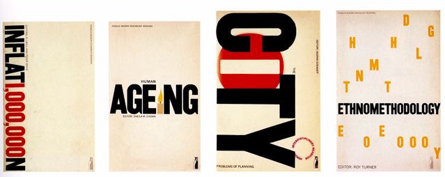
Jeffery Keedy
Keedy is a teacher at the California Institute of the Art since 1985. He has designed the type Keedy Sans in 1989.
“In the early days of digital design I was frustrated by how few good typefaces were available in digital form. Also I realized that most typefaces were extremely out-of-date an
d did not express the spirit of our time. I felt it had become impossible to do new typography with old typefaces that were exhausted of meaning.”


Keedy contributed to Emigre magazine in the twenty years of it publications. As a typographic designer he also writes a lot of essays fo
r different publications as Eye, I.D, Critique, Idea, Faces on the Edge: Type in the Digital Age and so on.
Keedy Sans was in the beginning (1989) considered illegible, weird, deconstructed, or confrontational design. Almost ten years later it's just another decorative type style, one among many. Its wilful contradictions are only what’s expected in design today.


So what is the difference between these two designers?
While Keedy jumped on to the digitalisation of type, Scher refused it for a long time, she had a distaste for the Swiss International Style. She said, “the act of organizing the Helvetica type-face on a grid reminded me of cleaning up my room”.


Keedy Sans has by The Museum of Modern Art in New York been collected as one of 23 milestones in the digitalisation of typography.


While Keedy embraced the new era, painting became Schers new media. Her book design for AIGAs (American Institute of Graphic Design) Garphic Design USA 11. A compendium of all the exhibits and competitions AIGA had held in 1989. This is what she says about the cover:
“The 1990 AIGA Cover was a spoof on graphic design in America, not dissimilar to the Print parody cover. I painted the information instead of typesetting it. It was writing as design. The cover simply took the words Graphic Design USA literally and then dished out some completely useless, nonsensical information. The front cover featured an eye whose eye lashed listed all the emotions and desires that might be attribut
ed to ambitious designers: fame, power, money, ego and
ennui. The eyeball carried an absurd dissertation about whether or not less is more. The background of the painting had a listing of every state in the United States, and the percentage of people in each state who used Helvetica. I made up the statistics, but I decided to base them loosely on the 1986 Reagan-Mondale presidential election. I reasoned that if Reagan carried a state the local designers were probably inclined to use a lot of Helvetica.”


Visual Hierarchy in Film Posters

The visual hierarchy of film posters has become standardised through much evolvement over time. Within these early posters you will notice they contain basic elements that still reside today.


Organisation is one major aspect that has developed over time, aside from the obvious heightened freedom and experimentation that technology now provides. Posters now offer a clearer sense of hierarchy. One might notice that text of the tagline or actors in pre-digital posters sometimes matched that of the heading. Ultimately, this causes the supporting text to compete with the heading. The Manchurian Candidate (1962), for example, gives off the feeling that the actors’ names are more important than the title. It makes it confusing in terms of what text should be read first. Arguably, the mass of text makes for an appealing aesthetic, but in terms of perceiving information, they lack.


In our contemporary society overloaded with media and advertising, of all text, the title of movie needs to be what stands out most at a glance. You can see how the heading in these posters has become the dominating text. It is not always the case, however, as you can see on the Friends With Benefits (2011) poster, but as a generalisation it seems to have become standardised element. Systematically, posters have also become more minimal in terms of amount of text. The use of taglines has become either shorter in length or non-existent.


References

http://retinart.net/graphic-design/50remakes-mr
http://justcreativedesign.com/2008/05/13/how-to-design-a-movie-poster-with-an-example
http://www.youtube.com/watch?v=ViTprcddgRo

!! IMPORTANT NEWS UPDATE REGARDING 3D PRINTING

Hi all! Thanks for the new posts. Keep them flowing please.

I have some important news regarding the printing of the 3D typography. All the files have been delivered for the files as I indicated. There has been a lot of discussion about developing a process where students and staff can submit an online form to order 3D prints. We are it seems the first group to use the system and so it has taken a while to sort out the bugs and identify the actual process.  The process for us is now as follows:

1. Go to this link and fill out the online form:
https://docs.google.com/spreadsheet/viewform?hl=en_US&pli=1&formkey=dGhxRUREeUxHVWdKSklDcjlrbEsxVUE6MQ#gid=0

If you have trouble accessing the form use this log in.

user:    cofa3dp@gmail.com
pass:    3dprototype

2. When you complete the form Hayden who is printing our files will then be able to send you a receipt that has the info you need to organise payment and picking up the print. Prices will vary depending on the size of your file.


3. When you go to pick up the 3D print take a screen grab of your design to confirm which is your print.
This is important so don't skip this step.


PLEASE NOTE: I have been advised today by Hayden that he will being printing the files on Thursday and Friday.

Should you have any problems with the form try the log in provided - if you still have problems then email me at: ian.mcarthur@unsw.edu.au

wk10 SR


Hi Lauren:
My groups is working on Letterpress history
and here is my spread about the Origin of Letterpress

Since we're working in RGB, Instead of placing a grim medieval portrait
I've chosen a picture of Dawn breaking to correspond with the theme of Beginning,
like Gutenberg's 42 line bible, the first letter pressed book that delivered light to the nights of the dark ages.


P.S. I got the photo from someone's blog, can I use it in ffi if I credit the source?


and some ideas I put together quickly for the cover


the red Ink was from the book that I showed you the other day
The frame in the 1st one was a photo I took of the wooden frames in the studio, too literal?  whatdo you think?

Louis

John Baskerville Vs Matthew Carter


John Baskerville - beginning his work in around 1750, Baskerville designed for a very different audience to Matthew Carter. Famous for his typeface named ‘Baskerville’, he introduced a typeface that had more contrast in it’s letterforms - thicker and thinner strokes than previously seen. His layouts at the time were full of negative space, lacking many of the organic flourishes that were common in page layouts of the time.


At the time, Baskerville’s work was considered to be amateurish but eventually other typographers would draw inspiration from his work, such as Bodoni. The V in Baskerville is a terrific showcase of what Baskerville had pioneered - the thickest line is 4 - 5 times thicker than the thin line, creating great contrast while maintaining a legible form that was still easy to read in print.


Matthew Carter designed for Microsoft. His portfolio included Verdana, Tahoma and Georgia. Verdana was very different to Baskerville. It’s letterform’s were a consistent thickness and aesthetically uninteresting. Designed to be a legible typeface for the screen, due to the quality of the screens at the time it was a sans serif typeface. Fonts that were once legible such as Baskerville on paper found themselves harder to read on screen due to the low quality of the screen that meant the serif’s often weren’t rendered clearly.

Type Everything

http://typeverything.com/

Monday, September 26, 2011

WEEK 10 and lots happening here - good to see!

Welcome to Week 10. I think that both Lauren and I are pleased to see the increase in posting in response to the lecture discussion points this week. It really is important that you catch on to this. For one thing it makes the blog so much richer. Your posts read really well, are well referenced and illustrated and discuss very pertinent examples. The other important thing to remember is that your online responses are integrated into the Research weighting in the course assessment schedule. Research attracts 40% of the total mark for this current project.

I'm posting a link to the next lecture which in  timely manner deals with Breaking Rules Well. Given our current project to design an online publication such a theme allows you scope to experiment wiht the design and layout and the content of your publication. I do like the themes suggested by the range of titles as I mentioned earlier.

The associated tasks for this week include:

Discussion Point: Reflect on your perspectives and your position on the relevance of typographic conventions and traditions in contemporary publishing contexts. Discuss your views in the context of relevant examples. Post your response to the Studio Blog.
Studio: Group to select by vote the design concept/grid that will be adopted for Project 2.
Self-directed: [SR3]: Students to keep a daily account of their involvement in the group production team in order to reflect on the processes undertaken and their role in the project. 

I'll post an update regarding he progress of the 3D files asap. Stay tunes for more information and instructions regarding this.


Sunday, September 25, 2011

VISUAL HIERARCHY AND GRID DEVELOPMENT IN PACKAGING DEISGN

Almost everything we buy today is packaged in some kind of way. This is not only to protect the product, but also to brand and inform the consumer. Packaging design is a very important part of the design process, it is the packaging that catches the eye of the consumer, or even persuades the consumer to make a new purchase.

Before the emergence of digital technologies such as photo editing software, layout programmes and automated printers, packaging design was a fairly long process. As manual letterpress printing requires patience, time, and materials, much of the packaging designs were quite artistic and ornamental in style. This may be due to the time and effort required to manually create and produce a package design. Since this process was fairly time consuming, designers would spend more time creating their designs and decorating with flourishes and illustrations. Visual hierarchy was very important, as it needed to most effectively represent the product, as the packaging design would remain for some time.


In recent times, visual hierarchy and grid systems have been applied much more to packaging design as technology has allowed for fast and easy formatting. The ornamental style seen in the previous examples has since disappeared from many contemporary designs, as more information can now be applied to the package, resulting in more branding for the product.

Digital technologies have also allowed for constant variation. This allows companies to change and adapt their product’s packaging fairly easily using a style guide and grid format. This chocolate packaging exemplifies the impacts technology has made in visual hierarchy and grid. Each chocolate is individually packaged and designed so that the consumer can identify which is which. The large bold numbers act as identifiers, whilst the small type describes all the necessary information about the product. Compared to older packaging designs, these chocolate contain more information and can be simplified due to the usability of digital formatting.

http://www.smashingmagazine.com/2008/06/02/beautiful-and-expressive-packaging-design/
http://lovelypackage.com/vintage-packaging-beer-cans/
http://www.thedieline.com/blog/2010/12/9/vintage-packaging-pedro-cut-plug.html

THE WORLD BAR STYLE GUIDE

The World Bar is located in Kings Cross and is a popular venue for young people many nights of the week. The old website for The World Bar was very modern, using simple colours and large amounts of white space to create a sense of effortless design. This style guide looked great and worked well for a number of years. However, the main problem with this style guide was that it would better represent a design agency rather than a hip nightclub. The use of sharp sans-serif fonts such as Futura, and the soft palette colours added to this over designed feel.

The World Bar is situated inside an old four storey Victorian terrace house, with skinny stairways and small bar rooms on many of the above levels. The new style guide for the venue compliments this very well. The new website is set out in a rough grid configuration, which is filled with hand drawn posters and happenings promoting the venue. The simple colour palette of red and blue contrast well to each other, as each icon stands out from the page. The background pattern is has a Victorian feel, yet adds to the retro, sketchy nature of the style guide. The recent design for The World Bar is much more suitable and represents the venue very well. The gird structure allows for easy updates whilst maintaining control and consistency.


Friday, September 23, 2011

Hey Guys,

I sent out the gird today. A few emails bounced back, so if you didnt get it email me and I will send to you straight away. If you havent posted your response to last weeks lecture, or the weeks before get on top of it as I can see some are up. If you are having trouble email it to Ian.

I agree with Ian regarding the title 'The Pressing Issue', lets finalise the name this week. Good luck with your group grids this week and see you in class. If you have questions you can email me and Ill get back to you.

Lauren

Thursday, September 22, 2011

The New Era of Grids and Visual Heirarchies

New technologies are always developing, allower society to indulge in grerater convenience. Especially with digital technologies, it has allowed a wider variety in options for designing grids and visual heirarchies.
This is particularly evident in people reading the newspaper now a days. Some still choose to buy the physical printed paper, whereas some enjoy reading it online as a terms of convenience. The grids and visual heirarchies of these two forms are also quite different.


The traditional printed newspaper utilises many columns in the text, with smaller serif fonts. It has rather short line lengths and small leading. The overall page uses just black and white text except for the colour in images. These traditional newspapers appear to be visually less attractive compared to newspaper that are supplied online.


Newpapers online although provide the same content, but they are visually presented differently. They use slightly larger sans serif fonts, which the text appears in less columns, where other links and ads are placed within. Column width and leading are also a lot larger compared to traditional printed newspaper. Visually, the online news is a lot more colourful, which may attract the audience to read the news supplied online rather than the printed ones.


These attributes all have an effect upon how the audience chooses to read the news, online or physically with the traditional papers. On screen technology has clearly made a large impact upon these traditional conventions of the news, generating these largely contrasted grids and visual heirarchies of newspaper.

Typography in Context

Derek Birdsall born 1934, was a graphic designer whose work was modern and simplistic. Having a keen eye for detail, Birdsall strongly believed in the delicate balance of type, image, and textural influence such high quality paper and book bindings.

He remains faithful to a small handful of typefaces including Bell, Bodoni, Eric Gill's Sans, Joanna and Modern, believing that the choice of typeface need not be arbitary as quoted in his book 'Notes of Book Design'.

'The suitability of a typeface to the subject of the book is less important than to the nature of its text. Text that contains dates, dimensions, formulae or footnotes needs a face with good numerals, fractions and mathematical sorts. Here, a type with numerals smaller than the capitals, such as Bell and Joanna, works well.'

This can clearly be seen in examples of book cover designs shown below. Birdsall keeps his designs very simple yet interesting, playing with type whilst maintaining legibility and keeping in mind his context.

Matthew Carter born just a few years later in 1937, was at the forefront of the transition from physical metal type to digital type. Unlike Birdsall, Carter did not show particular reverence to "old-fashioned" typefaces and designed many of the typefaces we use commonly today. These include typefaces such as verdana, designed to be readable at small sizes on a computer screen as well as Tahoma, Georgia, variants of Helvetica and many others..

Co-founder of Bitstream Inc and Carter & Cone, Carter worked for many prominent newspapers as well as for Apple and Microsoft to create typefaces for everyday mass use.

Yet Carter and Birdsall did have one thing in common, which was the dedication to simple, sophisticated and above all legible typefaces, with a focus on context.


For example Bell Centennial, a typeface commissioned by AT&T in order to fit substantially more characters per line without loss of legibility especially in small point sizes, for use in a telephone directory. Carter overcame issues with ink spread from high speed printing by opening up counters and bowls as well as placing ink traps (Shown on the side) which were not visible in small point sizes in print as intended.


Similar contextual awareness is seen in Birdsall's recent work in redesigning the Church of England's Common Worship Prayer book. With a simple poetic italicized Gill Sans on the cover and practical, legible layout of text on the inside.


So although Carter and Birdsall lived through the same time period, both designers worked in and with two opposite sides of typography. With Birdsall choosing to stick with the more traditional, older typefaces whilst Carter chose to jump straight into the up and coming digital typography world.

Yet both men clearly had similar philosophies and ideas towards typography and therefore ideologically contributed to typography in similar ways, whilst working with predominantly either a pre-digital or digital manner.

Sources:

Mike Dempsey, "Derek Birdsall: Between the covers", viewed 22nd September, http://mikedempsey.typepad.com/graphic_journey_blog/2009/06/between-the-covers.html

Design Museum & British Council, "Derek Birdsall" Biography, viewed 22nd September, http://designmuseum.org/design/derek-birdsall

Nick Sherman, "Bell Centennial Form & Function: A detailed looka t the telephone book typeface", viewed 22nd September, http://nicksherman.com/articles/bellCentennial.html

Design Museum & British Council, "Matthew Carter" Biography, viewed 22nd September, http://designmuseum.org/design/matthew-carter

Wednesday, September 21, 2011

Hierarchy & Grid --[Louis.02]

IMHO, visual hierarchy and grid system evolved just as our desire for control and thirst for information escalates. In this post, I’ll use examples of the most published book in every language to evaluate how and why visual hierarchy evolved.

 
calligraphy scripted Bible

The lecture suggested that humans are living to take pleasure in orderly things,this was once the purpose of letterpress.
The standardised letter forms resonated with each curve, repeated rhythm flow through every stroke. The unified lines, weighting and spacing all gave us great pleasure having eliminated randomness in handwriting. 

Predictability and control are beautiful goals for hierarchy and grid, they were also the dream goals that bible copying monks strived to achieve.
They studied heavily on the techniques of calligraphy, the art of decorative layouts to bring forth the sense of order in visual hierarchy.


 Gutenberg's Bible. Letterpressed Bible later illuminated(hand decorated)

With the invention of movable type printing, Gutenberg's bible reached that same goal while satisfied wide distribution of information,
and for 300 following years, letterpress served our desire of control and thirst for information.

  
Digital infographics of Bible Timeline & Interactive Bible Event Map

Today, the refined, controlled, dictated forms of lettering is the norm of digital age, letterpress is no longer the appointed carrier of visual hierarchy,
once the dream of calligraphy enthusiast monks, have on its completion, brought closure of its pursuit.

We have new desires to satisfy and new media channels to distribute information.
The glowing surfaces of tablet readers and mobile phones meant that information has to be rearranged for ease of access while maintaining legibility, on the go.


With the emergence of digital technologies, visual hierarchy and grid evolved and became more dynamic to fulfil our expectation of order & control, and more adaptable for new distribution channels of information to quench our thirst.


Louis


http://izaacta.blogspot.com/2010/04/improve-your-preaching-with-pretty.html
http://designingthenews.com/visualisations-and-infographics/
http://designphiladelphia.wordpress.com/2011/06/09/penn-in-hand-selected-manuscripts/
http://welovetypography.com/tag/manuscript/
http://hannahcorbett.blogspot.com/2010/12/when-and-how-was-first-book-in-europe.html
Johannes Gutenberg: the inventor of printing CFA 686.1/1
Letterpress: the Allure of the Handmade CFA 686.224/67
Thinking with Type CFA 686.22/55