
Myriad is a humanist san-serif typeface designed by Robert Slimbach and Carol Twombly for Adobe Systems. Myriad is easily distinguished from other san-serif fonts due to its slanting ‘e’ cut and its special ‘y’ descender. Myriad has a warmth and readability that result from the humanistic treatment of letter proportions and design detail. Myriad's clean open shapes, precise letterfit, and extensive kerning pairs make this unified family comfortable to read, while the wide variety of weights and widths in the family provide a generous creative palette for even the most demanding display typography.
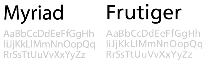
In the early 90s, Robert Slimbach and Carol Twombly set out to create a new san-serif typeface for Adobe, the goal was to create something very generic and they jokingly called the typeface ‘Generica’ during its design. The two designers worked simultaneously on opposite ends of the typeface, swapping designs, and smoothing out each other’s strong characteristics. As a result, the duo ended up with a typeface that could stand on its own, without reflecting the style of either designer. Myriad was released in 1992 and was initially compared to Frutiger which was designed almost twenty year prior but eventually came to stand on its own becoming a staple font of all Adobe products.
Myriad’s non-offensive, humanist properties have attracted numerous companies like Wells Fargo Bank, Walmart, and even Adobe to use Myriad for corporate branding. Most famously, Myriad was adopted my Apple Inc. as their corporate typeface in 2002. ‘Apple Myriad’ replaced its former Apple Garamond, which had been in use since 1984. Apple’s proprietary version is a customisation of the popular font with minor spacing and weight differences. The Myriad typeface has become a recognisable part of the Apple brand over the past few years. The typeface can now be seen on everything from iPads to Steve Job’s latest keynote—and inevitably on whatever shiny gadget the world is waiting for.

As time goes on, Myriad continues to gather support for the excellent typeface that it is. It recently became the default font for all Adobe products, a title previously held by Helvetica. So maybe some day soon, Myriad will be the ‘new Helvetica’ of this generation.
References:
http://idsgn.org/posts/know-your-type-myriad/
http://en.wikipedia.org/wiki/Myriad_(typeface)
http://ilovetypography.com/2007/11/06/type-terminology-humanist-2/
http://typophile.com/node/28658
No comments:
Post a Comment