Gotham is a big, blocky and un-embellished typeface, and according to critics one of the more important typefaces of the 21st century. It is my favourite because of its ability to function as a light body typeface, as well as a dominant, face-smashing headline (with Gotham 'Ultra').
History
Gotham was designed in 2000 by native New-Yorker Tobias Frere-Jones as a commission for GQ men's magazine. They still use it - not on the cover nameplate, just on the titles. He took inspiration from the decrepit signage of 1930s Manhattan. More specifically, this building...
It rose to prominence in 2008 by being the 'Obama font'. In fact, it was part of a concerted visual identity that is credited with giving a great deal of credibility to Obama's well funded campaign. There is a good interview here with Michael Bierut (the guy from the Helvetica movie) about his brand.

Critique
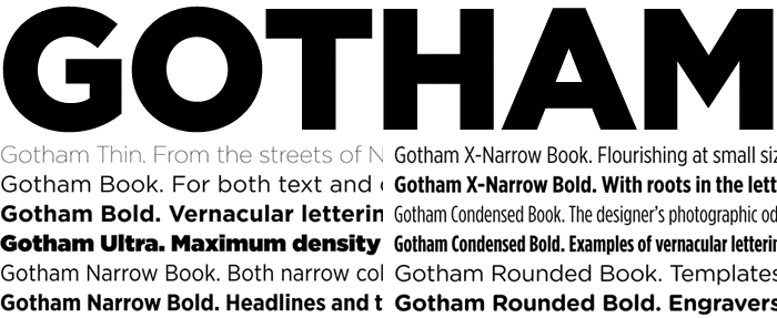
Gotham is a stripped-back, 'architectural' typeface, much in the way of Bauhaus-inspired geometric typefaces, like Futura (and before that Akzidenz-Grotesque). The designer himself stated "it's the letter ... an engineer would make". Others have likened it to the Manhattan street-grid.
Indeed, there is a very 'square' feel to each character, especially noticeable in the O (which appears a perfect circle). Legs are dead-straight and bowls are geometric on the upper-case letters, which were clearly the focus (compared to the lower-case). In its boldest font, it appears brutish, even with wide kerning. The middle stem of the upper-case M, in particular, is sharp and modern between two hefty slab stems.
It is simple, stripped back and yet full-on, and is definitively American.
No comments:
Post a Comment