
Myriad is a relatively young typeface, conceived by American calligrapher and typeface designer Carol Twombly and Californian based type designer Robert Slimbach. Created for Adobe Systems released in 1992, Myriad is now the default typeface set in it’s applications, taking over from Helvetica, which resulted in high usage due to people leaving the font as the default. Myriad is classified as a humanist typeface and therefore has a more organic structure than geometric typefaces such as Futura and Century Gothic.
Myriad was intended to be an invisible, generic typeface. To achieve this, the two designers would exchange sketches to remove each others unique, strong characteristics so that the typeface could become as transparent as possible, free from either designer’s personal flair. Due to it’s simplicity, it is often compared to other simple humanist typefaces, especially Frutiger, which was created 20 years prior to Myriad.
Robert Slimbach was quoted in Adobe Magazine as saying “We wanted to make almost a totally invisible type of letter, just very generic… something that really didn’t show anyone’s personality too much” - jokingly known as ‘Generica’.

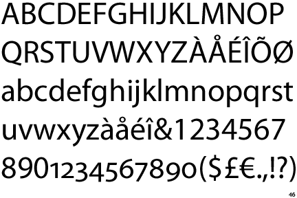
Myriad has a very uniform look, with perfectly straight stems, and flat ends. two distinguishing features of Myriad are the slanting e, and the descender on the y which has less of a curve than a lot of other sans serif typefaces. When Myriad was introduced, it was part of Adobe’s Multiple Master format, meaning that the 15 fonts that made up Myriad could have their weight and width axis changed to create hundreds of different weights of Myriad. OpenType has now replaced Adobe’s Multiple Master standard, and with it, Myriad is restricted to only a handful of fonts.
![]()
Myriad has enjoyed global popularity, being adopted by companies such as Woolworths and is one of two official typefaces at Cambridge University. Soon after Myriad’s debut, it was picked up by Eugene Mosier, art director of Wired Magazine, where it was heavily used. Mosier considered Myriad to be the “Volkswagen bug of typefaces”. Perhaps the most well known use of Myriad is by Apple Inc. who replaced Garamond with it in 2002, since then using it for almost everything, from marketing literature to product logos, such as the iMac, iPod and iPhone. Ironically, the open letter Steve Jobs released criticizing Adobe’s Flash platform was actually set in Myriad.
Myriad is a simple and elegant typeface, with a great amount of fonts making up the typeface, it makes for crisp, easy to read typography and allow the words to be read without influence from the typeface itself which has allowed it to be applied so widely.
A good review of Myriad Chris. As you correctly point out, for such a recently developed typograpic design it has enjoyed amazing popularity.
ReplyDeleteDo you prefer it to some of the other sans serif typefaces like Helvetica?
I prefer Helvetica a bit more, but it was interesting to research and since it's the default type face of InDesign I mostly change it for a fear of appearing lazy!
ReplyDelete